Illustrator, Photoshop
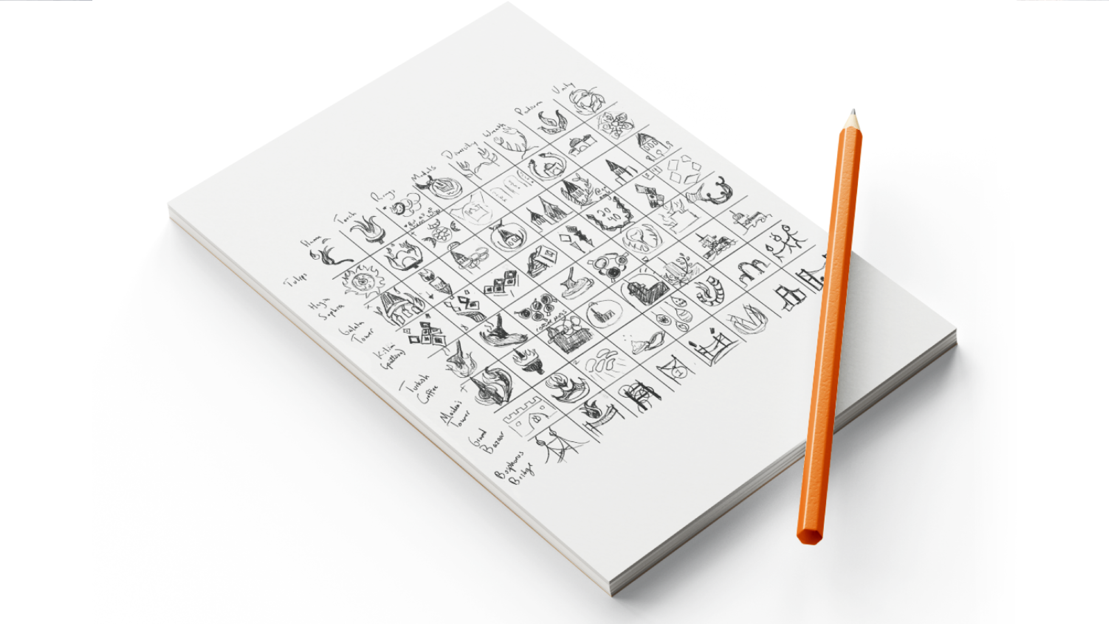
The Olympics project was an exploration into designing a brand different from more common business models. I chose Istanbul as my city and set and focused my research on food, architecture and textiles to find an identity that could represent this great city, if it were chosen to host the Olympics in 2040.
I was quickly drawn to the intense colors and textures I found in the textiles and cuisine of Istanbul. My research was limited to the internet, so I relied heavily on images and history for inspiration.
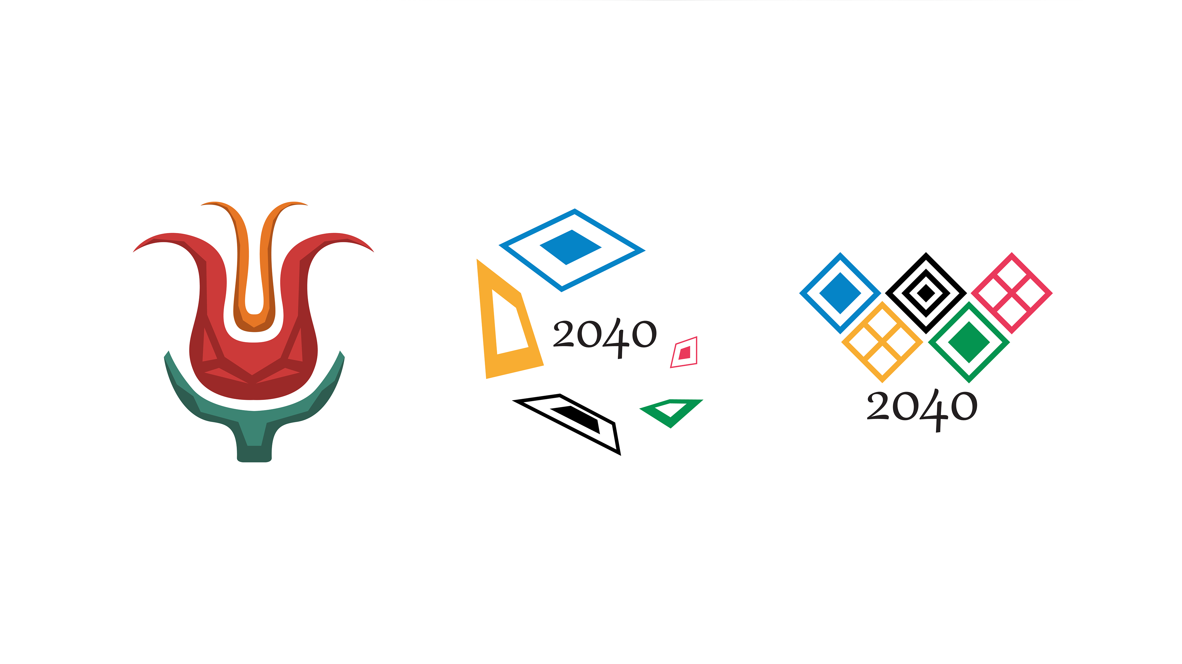
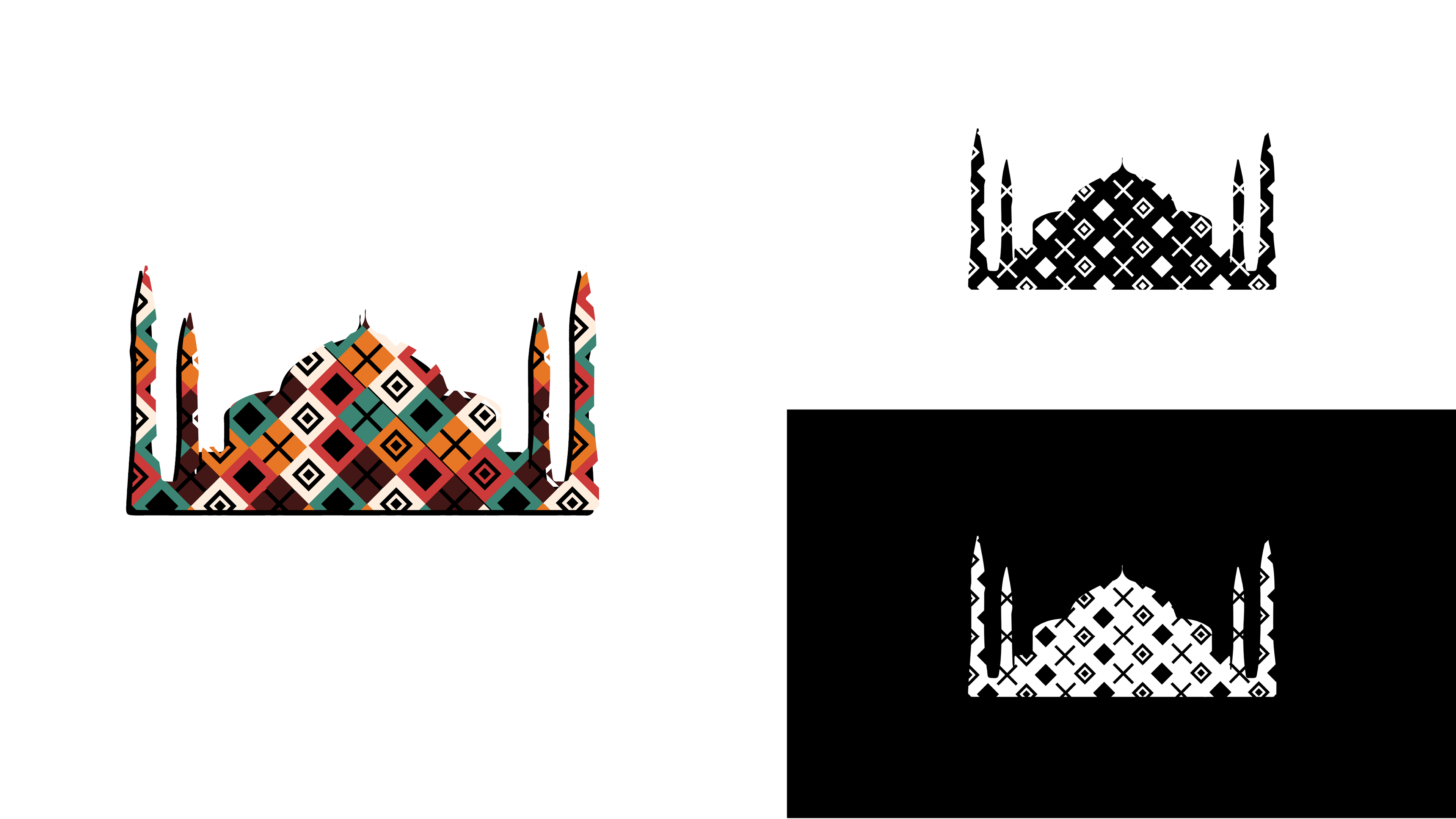
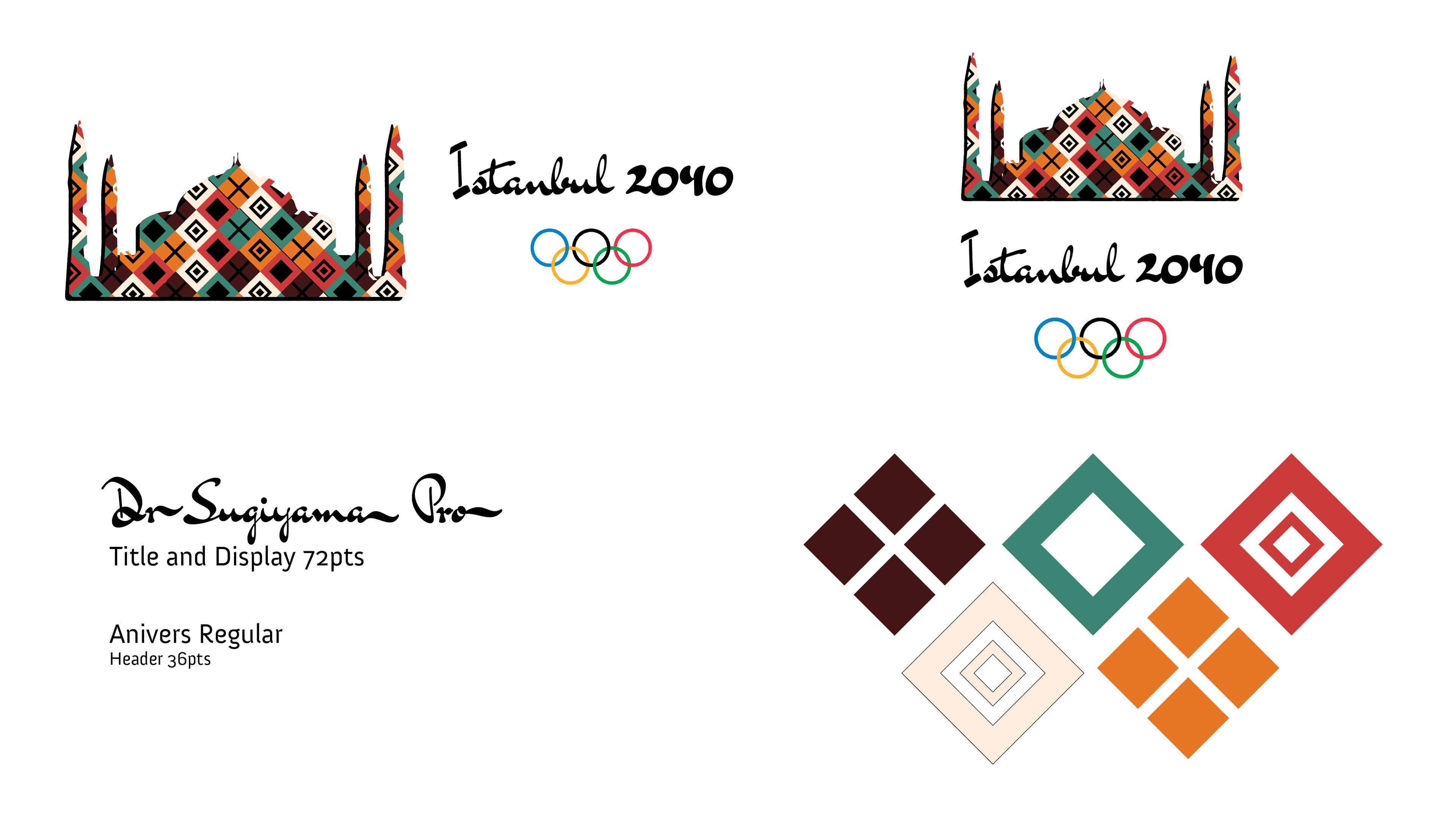
The mark combines a reduced silhouette of Hagia Sophia and three evil eye icons found in kilim patterning. These elements come from a surface exploration of Turkish culture to evoke the color and iconography of Istanbul. If given the opportunity, I'd like to learn more about the city to develop a more authentic brand for this concept.
For example, since finalizing this design I have received feedback from Istanbulites that Galata Tower would be a better representation of the city, whereas Hagia Sophia is a more Arabic symbol.
Icons were also made for the more popular events at the Olympics to explore how the brand might be integrated further. I stuck with the evil eye symbols and reinforced the geometric elements of my design in the figures shown below.
The equestrian events were included because they're my favorite to watch.
Lastly, some mockups were created to push the brand into different applications. Deck passes and tickets are essential to events like the Olympics, but I wanted to try something new in designing a sneaker.
